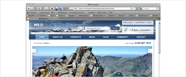
One of my pet hates is when designers preview the websites they’re working on as an emailed .jpg, rather than as an HTML file within the browser (which usually results in it being printed by the client). A design looks completely different when it’s printed out to how it does on the screen - not only are you printing a 72dpi / RGB design, but a printer renders text and images completely differently to a monitor. A website is a piece of interactive digital artwork and so should be shown in this way, even in the first stages of it’s development. Seeing as though 1024 x 768 is still the most popular screen size, when presenting your designs you should obviously make sure they work at this resolution, but by putting your design in a HTML file you are able to present it in any number of resolutions - Go on, impress your client by going that little step further and help them see that their site will look different, but just as great, on their computer compared to your 27″ iMac! ;-)

When designing a website the look and feel obviously plays a major part, but you can’t forget that the interactivity and user journey are just as important, if not more so. Just showing a range of .jpegs is great way to illustrate the design, but by simply placing the .jpegs in a html document (a bit like this one) and linking the files together you can give a much more accurate impression of how the site will feel to browse and be interacted with. And it’s not just for the benefit of the client, this is also great for your own personal design development as you may realise that certain elements don’t quite work when your design is in the browser, even though they might have looked great in photoshop, which can save a lot of time down the line…
Presenting your website designs to the client in the browser is most certainly the most efficient and effective way to do so. Its easy to forget that a client can struggle to visualise how your designs will look when they are completed, even if you do have a screenshot of IE around them. If your designs are in a simple HTML page then anyone can instantly see (more or less) how it will apear when finished, which parts are below the fold, and are able scroll down and discover the content and footer just like any user would. Don’t just stop at putting the .jpegs in HTML though, it’s really easy to place simple links over the page navigation that will allow the client to get a feel for how a user would navigate and flow though the site. By doing this you are making the experience much more real and exciting for them, and it will definitely help you sell your design if you’ve made any bold decisions based on user experience. It gives the client something to play around with and show other people, and it’s also a great way to package up your files - a web address is much easier to email than a .zip file full of images!
Not only is all of this beneficial to you and the client, it’s also a really good way to pass your designs on to a developer for production. “But what about roll-overs and other interactive features” I hear you say! Well just export a ‘roll-over page’ showing all the hover states, and put a quick scoping document together detailing all the other transitions and interactive requirements.
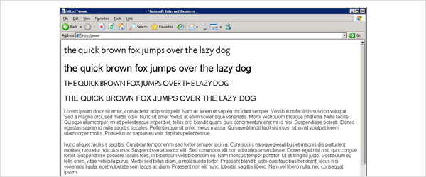
A major factor that’s often overlooked in web design is how live fonts render. Arial at 24px in Photoshop or Fireworks looks completely different to how it looks in IE on Windows XP with anti aliasing turned off…to be honest it looks bloody horrible! A live font in the browser never renders the same as how it does in your designs, but by producing a simple HTML style page with text coloured and sized using CSS you are able to easily define exactly how you wish the text to apear.

By setting out: <h1>, <h2>, <body> copy, links, and link hover states etc. you can significantly decrease the developers’ time and not leave them second guessing you with what size or colour text should be. You can also make other font related design decisions by testing them in a quick CSS document. Many @font-face fonts render beautifully in browsers such as Chrome, but horribly in IE, and this difference is made even greater when comparing Macs and PCs with OS X font smoothing.
At the end of the day it all boils down to designers just doing that little bit more to streamline the design process and help the client, the developers, and themselves - but they need to be able to code first, and that’s a completely different conversation altogether.
Shortlink:
By Chris Kemm
Comments are closed