The styling and formating of marketing emails is a fine art, but many people are missing a key factor with their design and build that may make or break the user’s decision to view the email in its entirety…
We are all familiar with an email dropping in our inbox and appearing as blank white space:
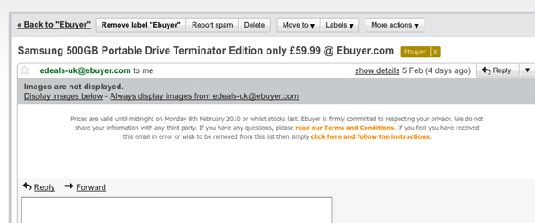
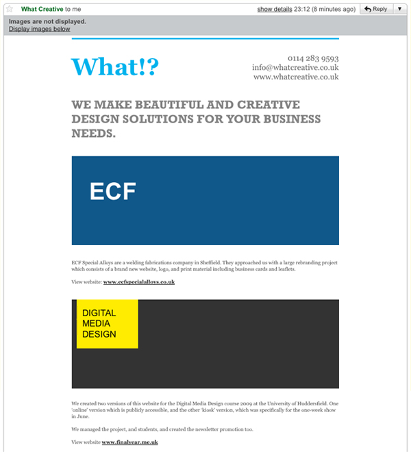
The above image is an example of emails not being designed and built to work with images disabled. To help with explaining this process I have built a quick email to illustrate how alt tags can be styled, cells coloured, and text positioned to produce a professional looking email before any images have been downloaded. By using these techniques the user will be given an impression of the message, and an incentive to turn on images and view your email in it’s entirety.
Example - Images Disabled
Example - Images Enabled
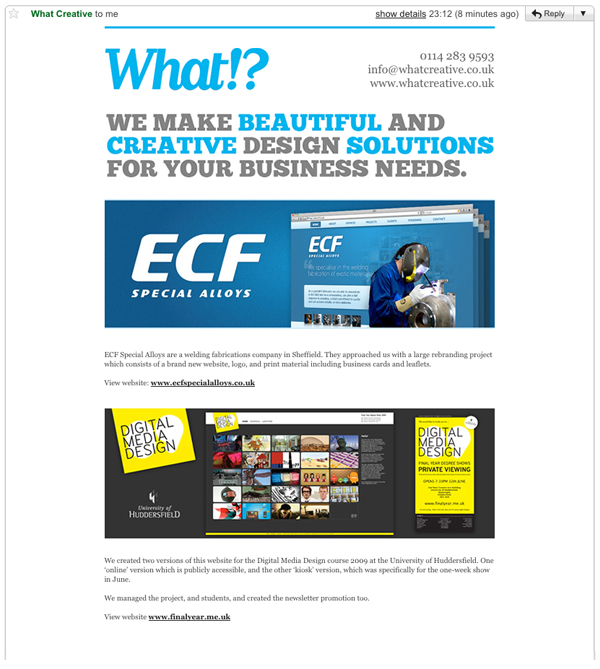
The screenshots above show how your email can render similarly to your original design without images having been enabled. The styling of alt tags, slicing of images and inclusion of specific cell background colours can be used to give the closest possible match to your original design. You may not be able to match your ‘images disabled’ email as closely as our example, but laying an email out in an the most aesthetically pleasing and informative way possible is crucial.
Styling Alt Tags
You can wrap your images in font tags and styles to edit the appearance of Alt tags in various email clients. To style the alt tag on the What!? logo I added the following code.
Original image and link html code :
<a href=”http://www.whatcreative.co.uk/” target=”_blank” style=”text-decoration:none; color:#00B3ED;”><img src=”img/what-logo.gif” width=”230″ height=”60″ border=”0″ alt=”What!?” style=”display:block;” /></a>
Alt styled image and link html code :
<font face=”Georgia, Times New Roman, Times, serif” size=”9″ color=”#00B3ED”><a href=”http://www.whatcreative.co.uk/” target=”_blank” style=”text-decoration:none; color:#00B3ED;”><font face=”Georgia, Times New Roman, Times, serif” size=”9″ color=”#00B3ED”><strong><img src=”img/what-logo.gif” width=”230″ height=”60″ alt=”What!?” border=”0″ style=”display:block;” /></strong></font></a></font>
The font tag is applied both inside and outside the link to cater for the alternative ways that email clients read the code.
Slicing Images
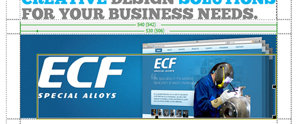
When building your email make sure you slice around all the images that you plan to apply Alt tags to in a way that will ‘fake’ padding when the Alt tags are visible. If you slice these images into three (a thin horizontal slice at the top, a thin vertical slice on the left, and the remaining image area). This tenchiqiue works particaly well with logos because it allows the user to see a visual impression of your brand, and helps to form that trusted connection needed in order for them to download the full email.
Setting Background Colours
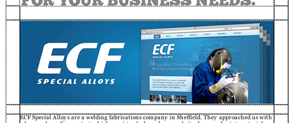
Applying a background colour to the cells in which the images reside allows you to format the ‘images disabled’ email to apear similarly to when images are enabled. This is not always applicable or visually correct but it does work in some cases, and if used intelligently can draw attention to certain areas of the email that include important information.
Background colour:
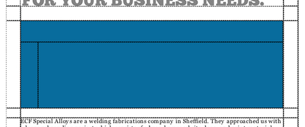
Image inserted:
These are just a few hints and tip that we use at What!? to create professional and effective email campaigns.
You may also be interested in this post: Create A Faultless HTML Email
Shortlink:
By Chris Kemm
Pingback: designfloat.com
Pingback: zabox.net
Pingback: Convert Your Non-Purchasers To Purchasers With Great Email Marketing | What!? We Like To Talk About