We always strive to use the latest technologies and techniques in all our work, especially on digital projects. Technology changes and moves so quickly keeping up to date can be difficult, but it’s essential in the web industry, and luckily I love experimenting with new code.
We were ahead of the game with responsive web design and we’re now developing this further with responsive e-commerce solutions. A common issue with responsive web design is serving the correct images to relevant devices. To try and get around this we approach our web builds “mobile first”, so this avoids the issue of loading large core images on smaller devices, but with more and more devices having high dpi screens such as the new Apple MacBook Pro and the Samsung Galaxy S3 we now find ourselves in need of four image types: mobile, mobile retina, desktop and desktop retina.
Up until recently high dpi displays were only a major concern on mobile devices, but Apple’s MBP has now brought it to a desktop device, and it’s only a matter of time before other manufacturers follow. We need to be ready.
Getting Started
There are a number of different techniques for serving the correct dpi images; using a CSS media query to detect the device-pixel-ratio, Javascript scripts such as Retina.js, and services like ReSRC.it (which goes step futher with bandwidth detection). The Javascript approach works well for replacing and improving body images, but logos and diagrams are often vectors and being able to serve these graphics in a vector format would fix the issues regarding pixel density - HTML text renders beautifully on retina displays so our vector logos and diagrams will too.
I decided to set aside an afternoon to experiment with SVG graphics, but more specifically I wanted to find out about using them to serve a websites h1 logo graphic. I researched and read a number of posts online and then started to experiment. Ideally I wanted to style the h1 tag with CSS and serve up the SVG graphic as a background image, then use CSS3 background-size to adjust the logo depending on the device screen size. In theory I would then only need to create one image instead of four…
h1 {
	display: block;
	background: url("svg-logo.svg") left top no-repeat;
	background-size: 100% 100%;
	text-indent: -99999px;
	width: 127px;
	height: 65px;
}
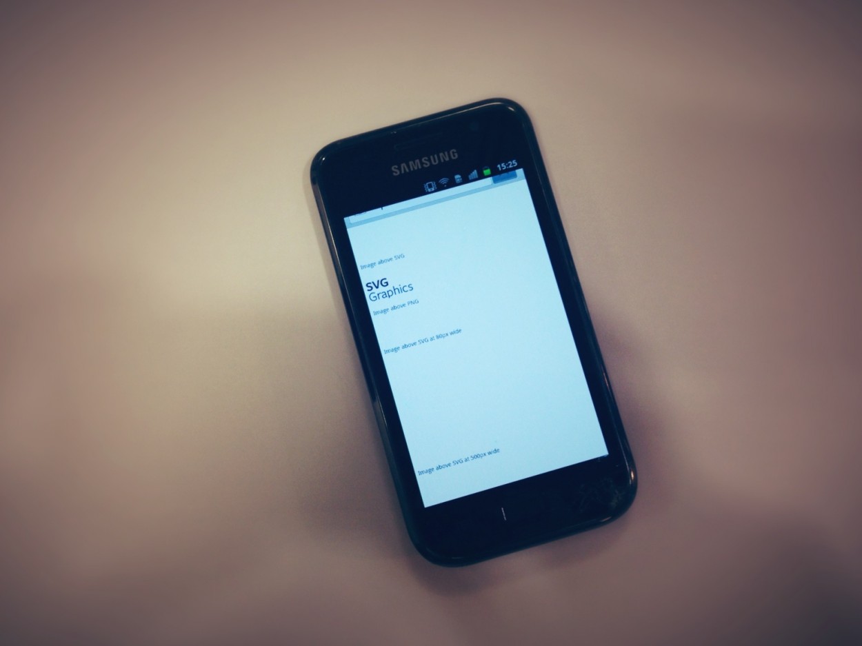
The first couple of experiments worked well. The SVG logo I created was only 4kb, scaled up perfectly on my Mac and looked super crisp on the iPad’s retina display - the logo also resampled and stayed crisp when zooming in on the iPhone. I then started to test more thoroughly on desktop machines starting with Internet Explorer, and surprisingly SVG graphics aren’t supported!
Overcoming Problems
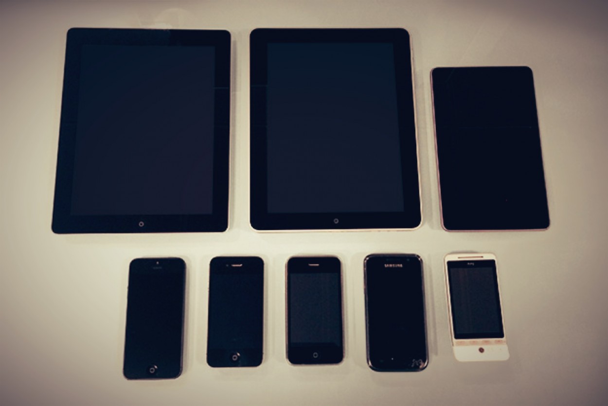
I needed to replace the logo with another graphic that would display on IE8 and below so I used a conditional comment and separate CSS to achieve this, but I soon realised that there could be a number of other devices and browsers with the same lack of support. After further testing on several Android devices that we have in the office I ran into a couple of issues:
- Galaxy S3 - Android 4.0.4: Renenders SVG graphics and background resize but doesn’t resample well on zoom (however resampling on zoom isn’t a major issue as zooming isn’t really necessary on a responsive website)
- Galaxy S1 - Android 2.3.5: Doesn’t support SVG
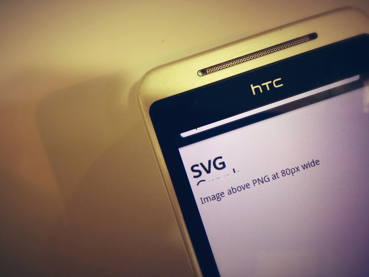
- HTC Hero 2 - Android 2.1.1: Doesn’t support SVG graphics or background resize (Oh dear!)
The lack of support on the Galaxy S1 was the biggest shock considering we don’t have any problems at all with older Apple devices - I’m puzzled as to why support wasn’t there from the first version of Android. However, our testing flagged up a number of issues with other devices too so we need to detect if the device / browser has support for SVG or not and serve a PNG (or similar) instead.
We use Modernizr at What Creative to get older browsers to play ball with HTML5, which adds a “.svg” class to the html element if the browser has support, and “.no-svg” if it doesn’t, therefore allowing us to create a CSS selector to serve a PNG graphic. If you aren’t developing in HTML5 (which you should be) then you might argue that it’s unnecessary to load the whole thing, but it’s only 15kb so it doesn’t take many large PNG’s to outweigh that argument! (Besides, you can customise your Modernizr toolkit and just include the bits that you want)…
html.no-svg h1{
	background: url("svg-logo.png") left top no-repeat;
}
Due to the fact that newer devices with high dpi screens have support for SVG we don’t need to worry about a high dpi PNG, we can simply resize the SVG depending on the device screen size using a combination of background-size and media queries. However, as older Android devices don’t support background-size we’ll need to create PNG graphics and use media queries to swap the file depending on device screen size.
Conclusion
So, we now have to create an SVG for high DPI screens (mobile & desktop), a PNG for mobile, and a larger PNG for older desktop/tablet browsers (you may also need to create another PNG for tablet devices depending on your design)… not quite our ideal of having one-image-fits-all, but 3 is better than 4!
You can view my SVG test page here
Quite frankly, using SVGs instead of multiple PNGs doesn’t save development time as we need to support older browsers and add PNG fallbacks, but it’s a future-proof way of knowing your logos and vectors will look perfectly crisp on all the latest and devices.
Reducing load times on a mobile devices is key to successful responsive web design and as more desktop machines move to high dpi screens SVGs will be key to keeping file sizes down and achieving super crisp graphics.
AddType image/svg+xml svg svgz
AddEncoding gzip svgz
Note: You may need to add the code above to your .htaccess file to get SVG working on your server.
By Chris Kemm
Pingback: Veille #30 | Le Blog - julienvennin.com
Pingback: Tweet Parade (no.02 Jan 2013) | gonzoblog
Pingback: Starting out in mobile development - what testing devices should you buy? | What Creative Design Agency