We began this two part series on texture in web design by talking about text and button textures, and how they can be used to inset, or outset page elements. These help to add more depth and subtle aesthetics to your designs, making them look more professional and polished. This week, we’ll be showing you how to add texture to other page elements such as your backgrounds / content areas, as well as how to use pixel patterns to make your text and box-shadows more interesting.
Noise and Grain
Noise and grain is all over the web at the moment, with some big players in the design community using it very effectively in their designs. A good example of this is Dribbble. If anyone doesn’t know what Dribbble is then you can read about it in this post.

So, how do you create this effect?
First, open your design in Photoshop and then select the layer that contains the design element that you want to add noise to (for this example I am simply going to use the background, however it can be applied to almost anything!). Create a new layer above this one, select the paint bucket, and fill it with white.
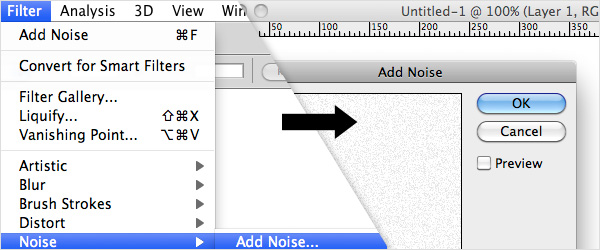
Next, got to Filter > Noise > Add Noise and a little window should open. In the box that says ‘Amount’ type 12, and then select ‘Uniform’ in the Distribution box underneath. Finally, make sure that the ‘Monochromatic’ box is ticked at the bottom. These are the settings that work best for me, but please feel free to play around to get your desired effect. Once you’re happy with the amount of noise, press the OK button.
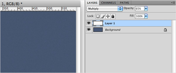
Next head over to your blending modes drop down menu (at the top of your layers pallet) and select ‘Multiply’. This should make the white background to the noise vanish and reveal the colour of the background behind (but with the noise speckles still visible). You’ll notice that this is almost the effect that we’re after, but it’s a little too contrasty at the moment. Simple fix = lower the opacity of your noise layer. Sorted!
This effect can be applied to almost anything: Buttons, title backgrounds, navigation backgrounds, content boxes etc. So give it a go and see how it looks on your designs!
Pixel Patters
Another increasingly more popular design ‘trend’ (if I dare use that word) that’s popping up all over the Web is the use of pixel patterns to add extra, more unusual aesthetics to typography and other design elements. The term ‘pixel pattern’ simply means a pattern that is made of solid pixels (without any anti-aliasing). This gives them a very sharp and defining edge which is great for making them stand out when used at very low opacity. They are usually very small, simple, repeating patterns such as hashes, diagonals, or circles.
You can make these yourself (which can sometimes be a little time consuming), or use open source designs by other designers. Naomi Atkinson recently released these patterns after demo-ing them on Dribbble.
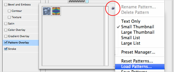
To install a Photoshop pattern, firstly download the files and unzip the contents. Then, open Photoshop, create a new layer, and open your Layer Styles by double clicking the right hand side of this layer. Select Pattern overlay in the window that pops up and open the Pattern Picker by clicking the down arrow next to the pattern preview box.
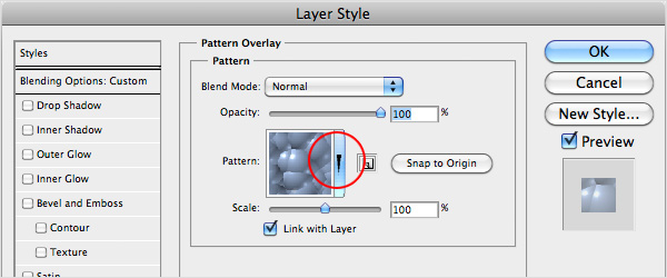
Another little window should open, to the right of which will be a little arrow. Click this arrow, and then select ‘Load Patterns’ from the list that appears. When the browse window opens, locate your pattern file (which is a .pat file), select it, and press Load.
Now you’re free to add the patterns to any object that you create in Photoshop!
You can play for hours with these trying to get the right effect. Make sure you experiment with blending modes and opacity once you’ve applied the patterns - This works especially well with text (see the title of this post for an example). You can also use them to add decorative drop shadows to boxes, or you can apply them to entire backgrounds and use them as an alternative to the noise effect.
Other Textures
There are all sorts of other textures that you can apply to your designs using very similar techniques to those discussed above. One of the easiest is to use photography or textures that may have originally been intended for 3D renders.
One example is a paper texture (or crumpled paper to be more specific). There are loads of free textures out there on the web, so go hunting and find some that you might like to use in your designs.
Save the photo to your desktop, import it into Photoshop and paste it into your design. If you have a coloured background then make sure your texture layer is above this, then switch the Blending Mode to Multiply and play around with the opacity. You can get great effects like this:

Grunge or ‘dirt’ textures also work perfectly using this technique. Bare in mind though, that if your texture has strong colours in it you may need to convert it to black and white, or even increase the contrast to create the desired effect.
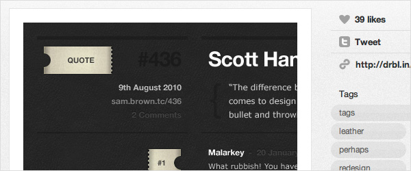
Another interesting alternative texture is the leather effect seen here in Sam Brown’s Dribbbles:
There are hundreds of ways of applying these techniques to your designs, and many more types of texture than I have mentioned here. From what I’ve seen these are the most popular, but just as they are beginning to filter down into mainstream design I can’t help but feel that the guys (or gals) at the top will start pushing the boundaries and applying some even more creative Photoshop magic to their designs.
What do you think will be next?
By Chris Skelton